“Blue states are black holes for tax money!”
This is the second episode in a series examining which states contribute more to the nation, with the main goal of figuring out if “red or blue states are the welfare states”.
In today’s post, we’ll look at which states contribute MORE than they receive in welfare benefits paid by the government, and which states contribute less than they receive.
This data comes from fiscal year 2024. I used the summarized data found at USAFacts to build the table, but the underlying sources are USA Spending and the IRS.
The following chart shows the averages of deficit or surplus from red to blue states, as well as the overall average to compare.
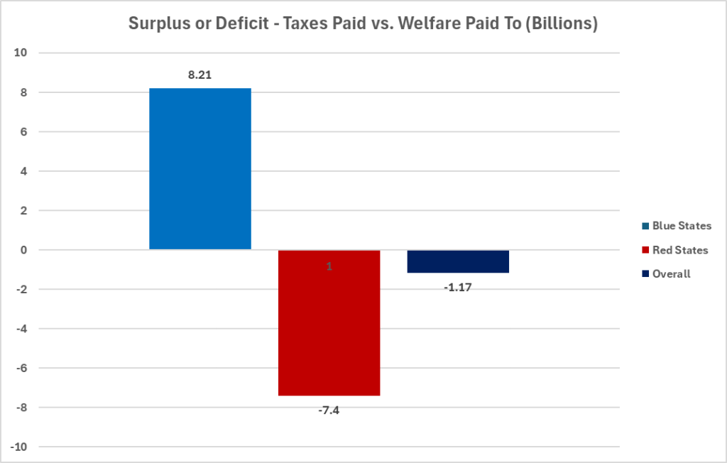
On average, states that voted blue sent $8.21B more to the government than they received back in welfare. Red states, on average, cost the government $7.4B more than they paid in for taxes. Overall, the average number is a $1.17B deficit between taxes paid in and welfare paid out.
So, what about Minnesota?
Minnesota sends in $50B more than we take in from the government. We are certainly pulling our weight!
Future research will include what factors contribute to these numbers. For now, it’s interesting to see that there is such a marked difference between how states vote and how they line up for welfare numbers.
Thanks for reading!

Leave a comment